01 / BRAND & EDITORIAL DESIGN

A PRACTICE JOURNAL FOR MUSICIANS
BRAND IDENTITY / LOGO DESIGN / EDITORIAL DESIGN / PRINT DESIGN
A two-part design project exploring the relationship between music, movement and creative practice.
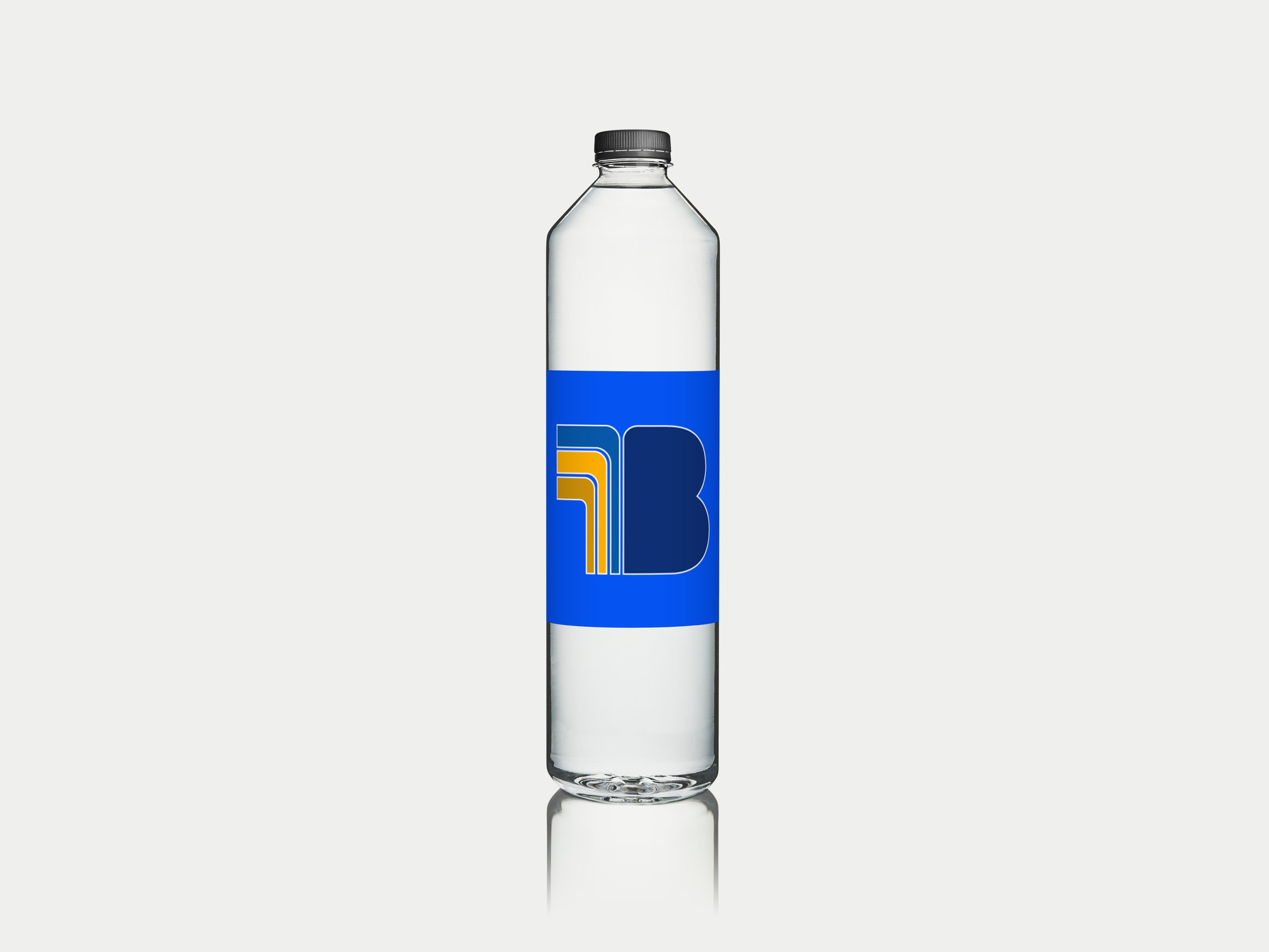
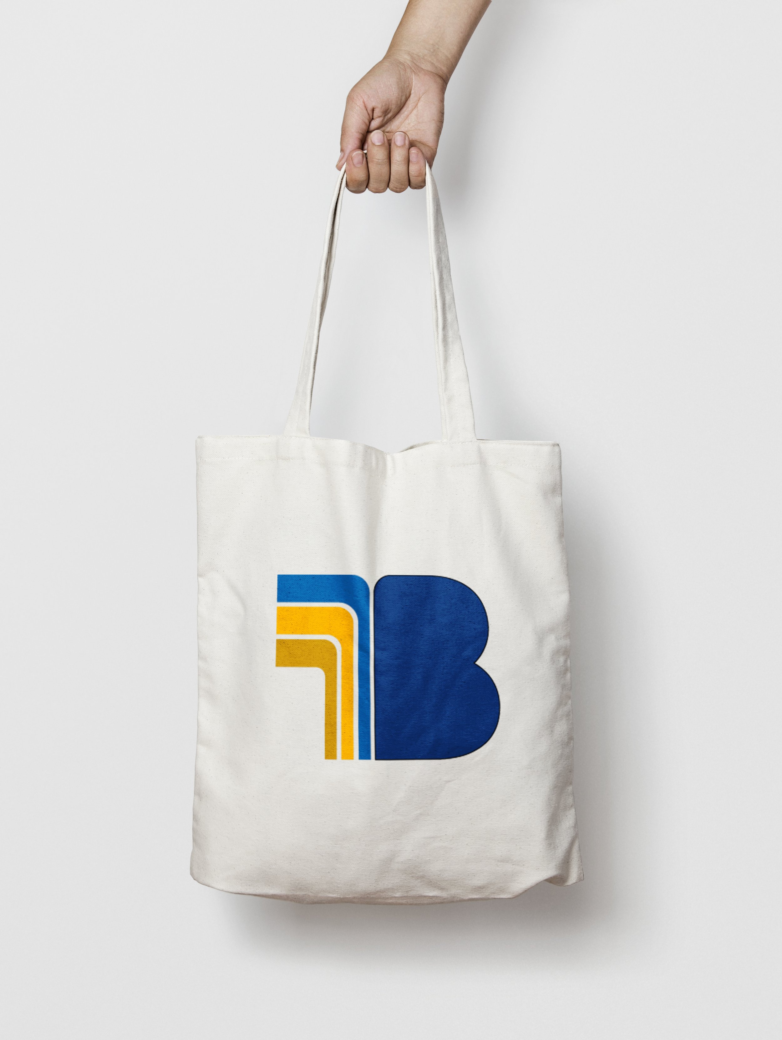
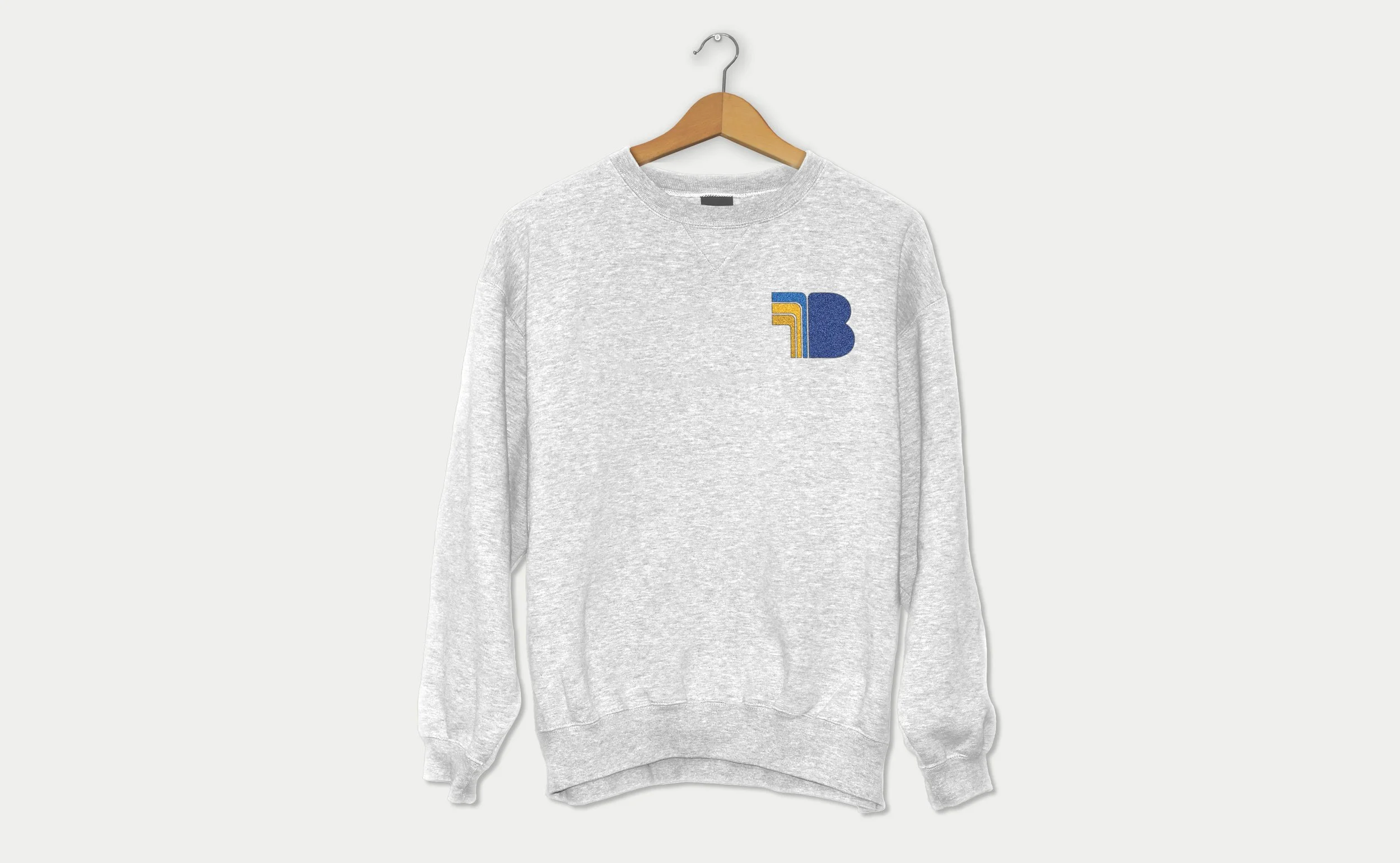
Originally developed as Belltone, a personal training concept specifically for musicians, the project began with a complete brand identity, including logo design, colour palette and merchandise concepts.
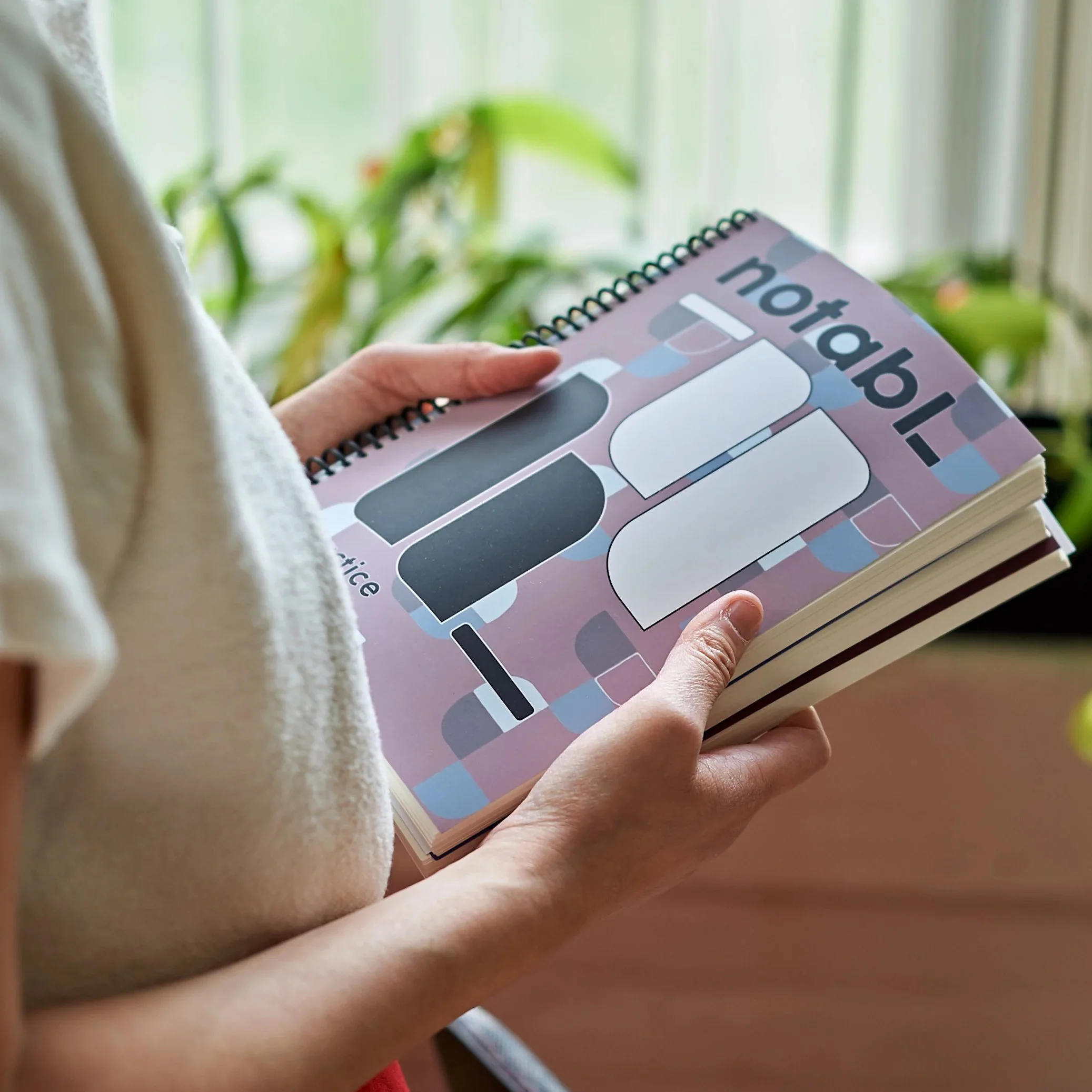
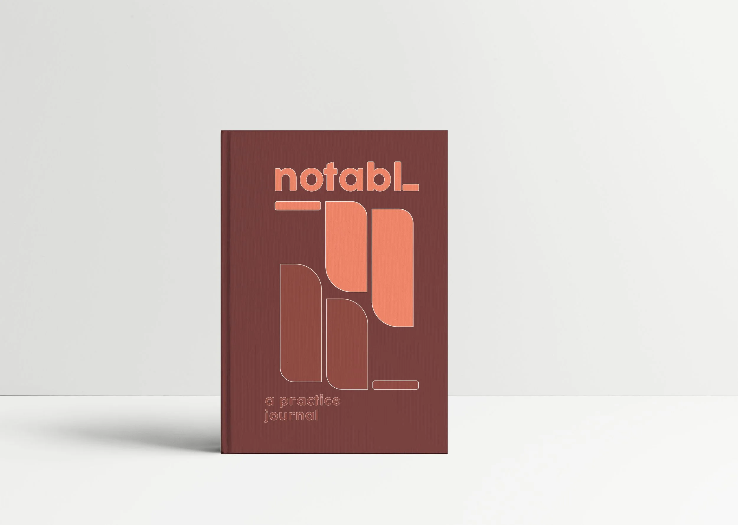
When the client's direction shifted toward developing a practice journal for musicians, the project evolved into Notabl. We created a new visual identity, journal cover designs and a custom interior layout incorporating practice planning, time tracking and reflection.
The resulting journal was brought into production and is now commercially available through Notabl.'s online store.

02 / BRAND IDENTITY



A bold and minimal visual identity designed to feel modern, focused and creative. The rounded forms and underscore nod to a sense of progression and practice, while the colour palette brings warmth and personality to the brand.
03 / JOURNAL COVERS
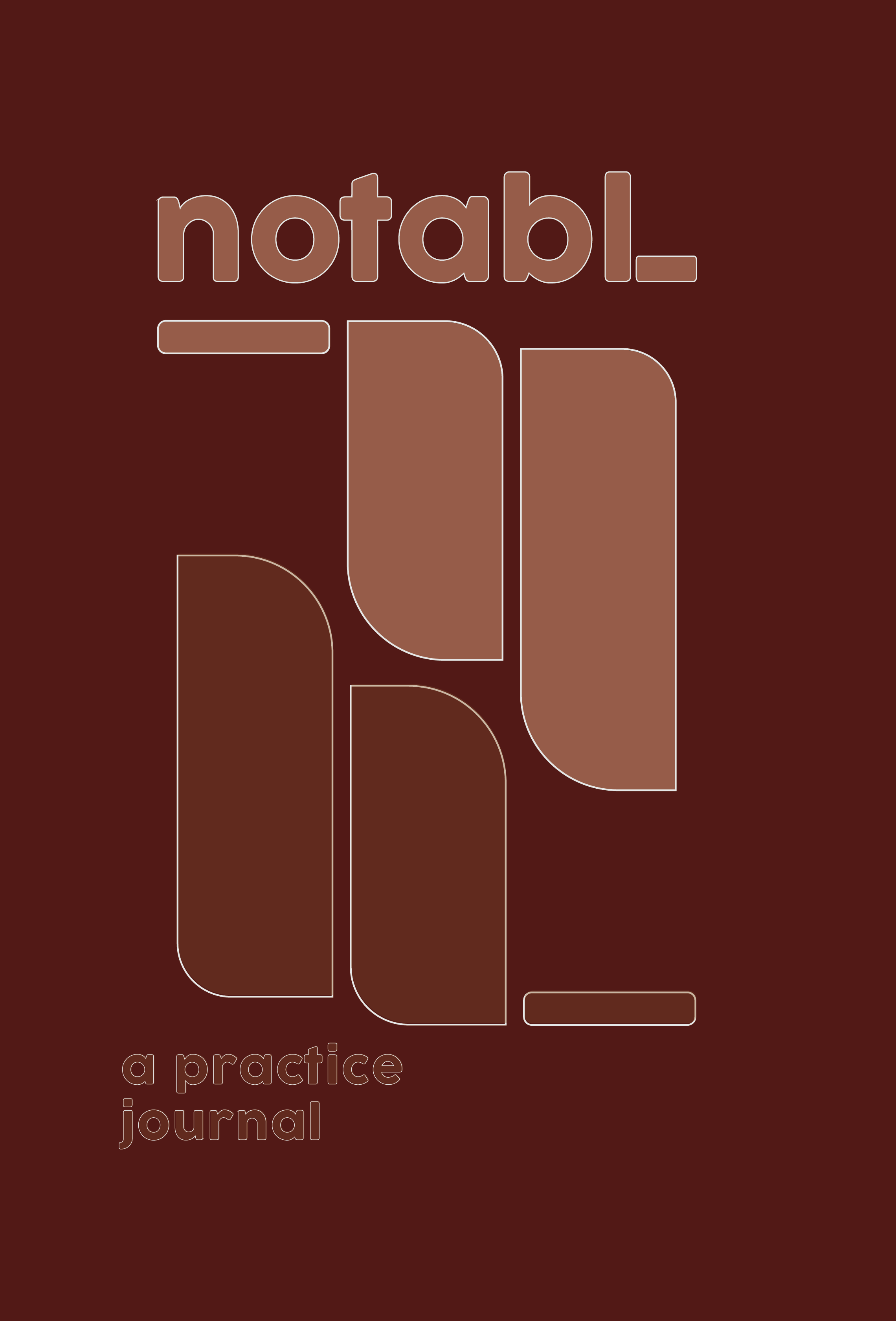
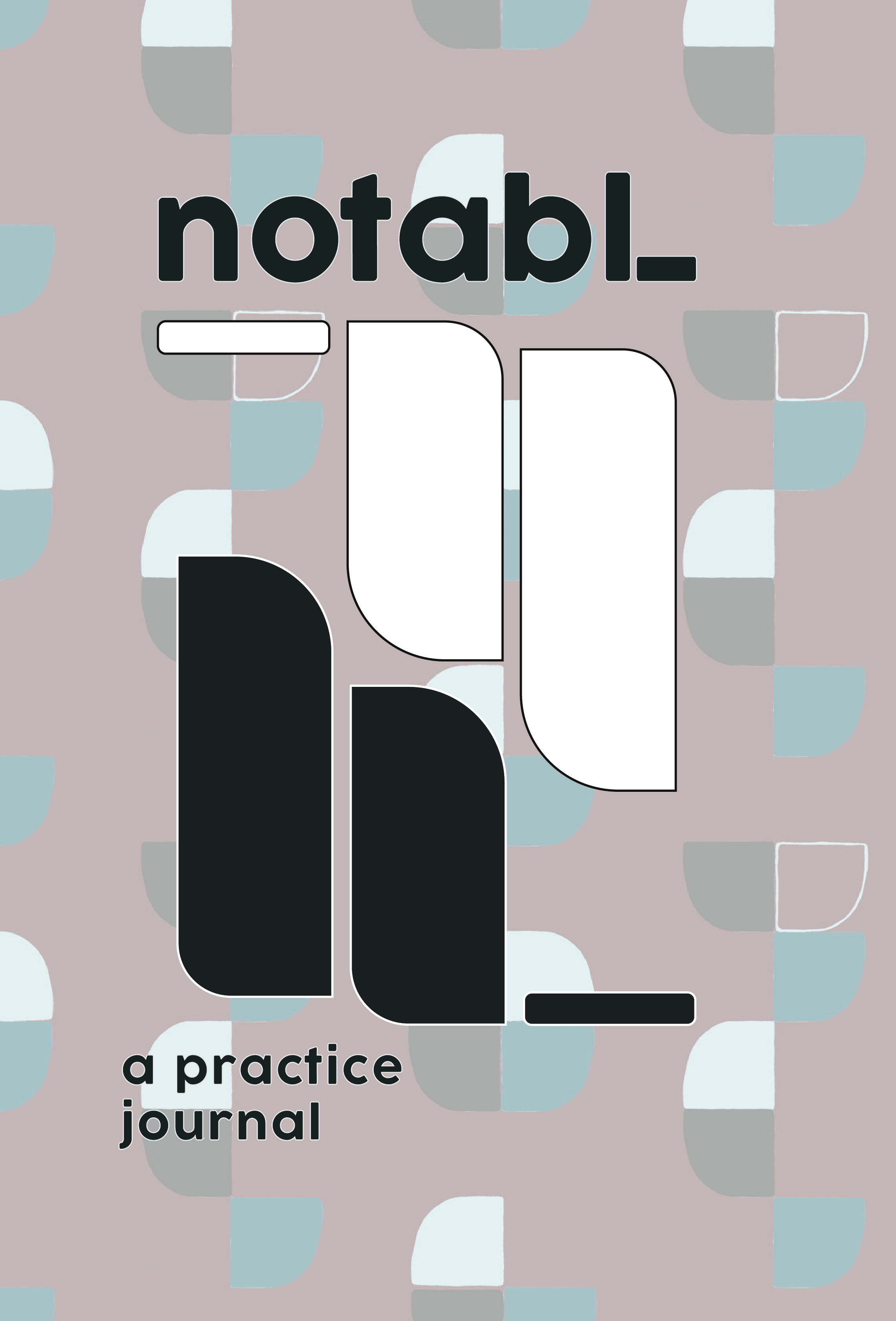
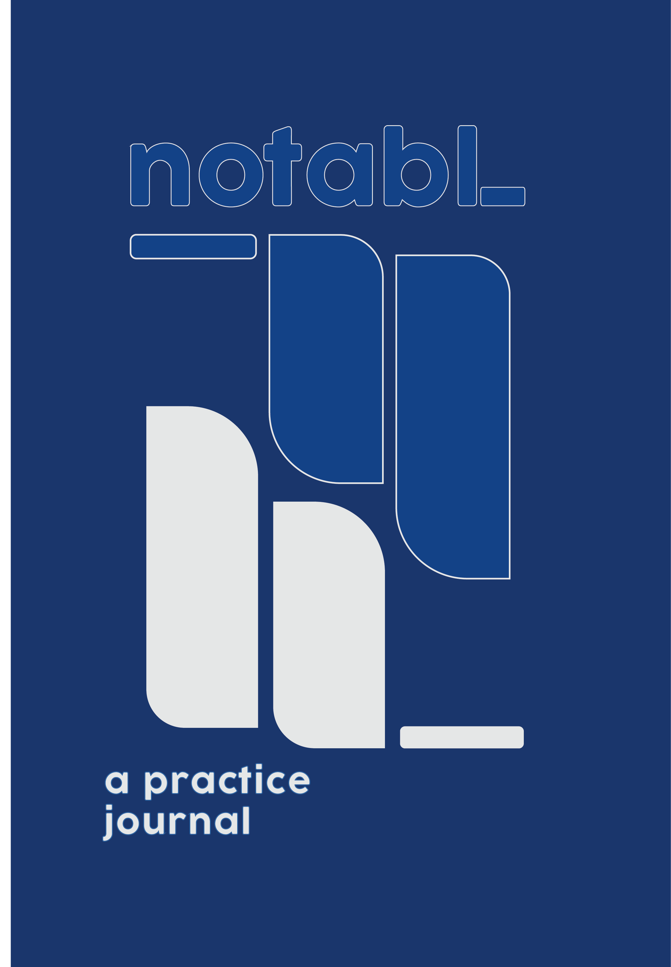
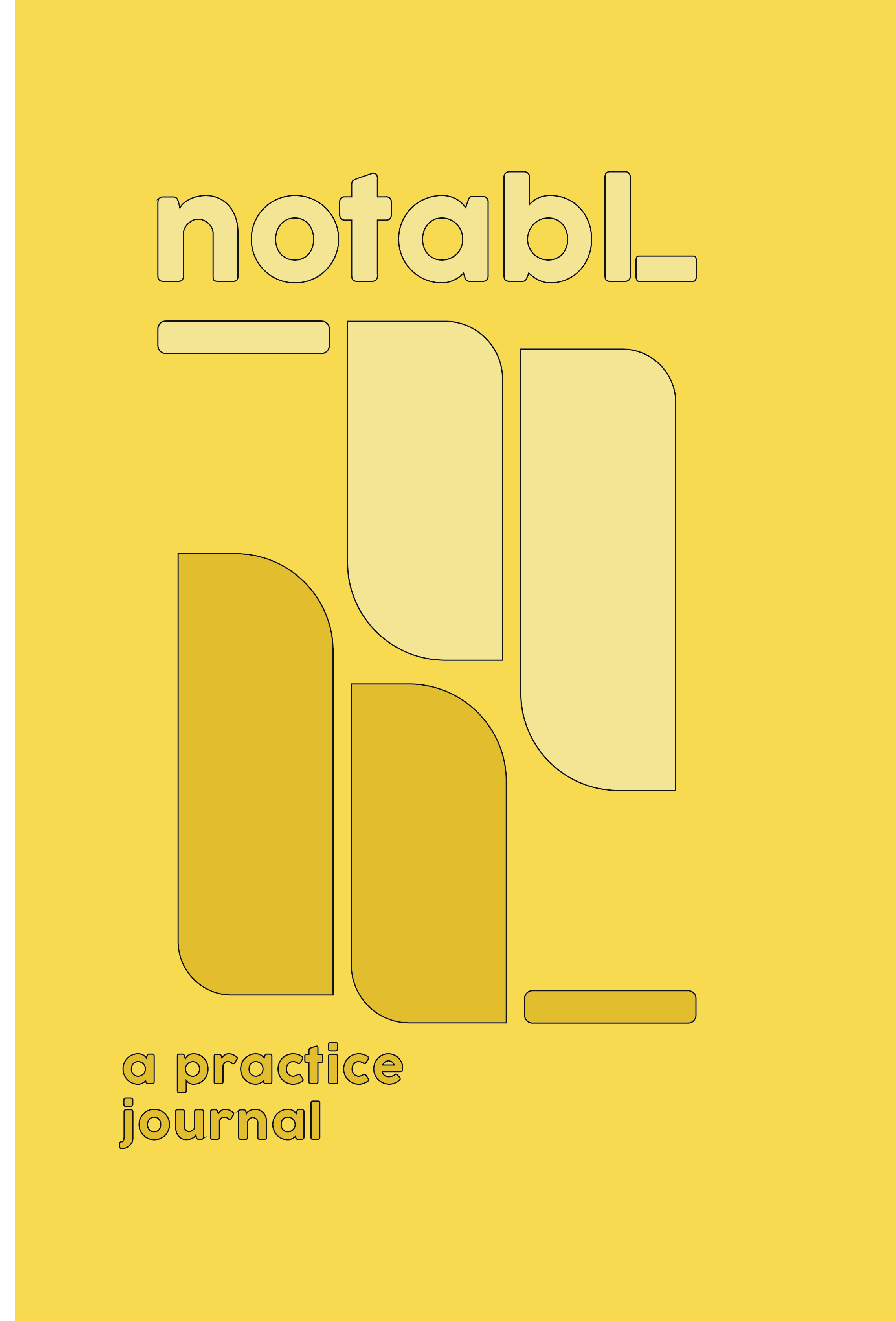
FINAL JOURNAL COLOURWAYS
The journal's cover designs also incorporate an original Flodström wallpaper pattern, bringing together graphic design, illustration and surface design.
04 / INTERIOR LAYOUT
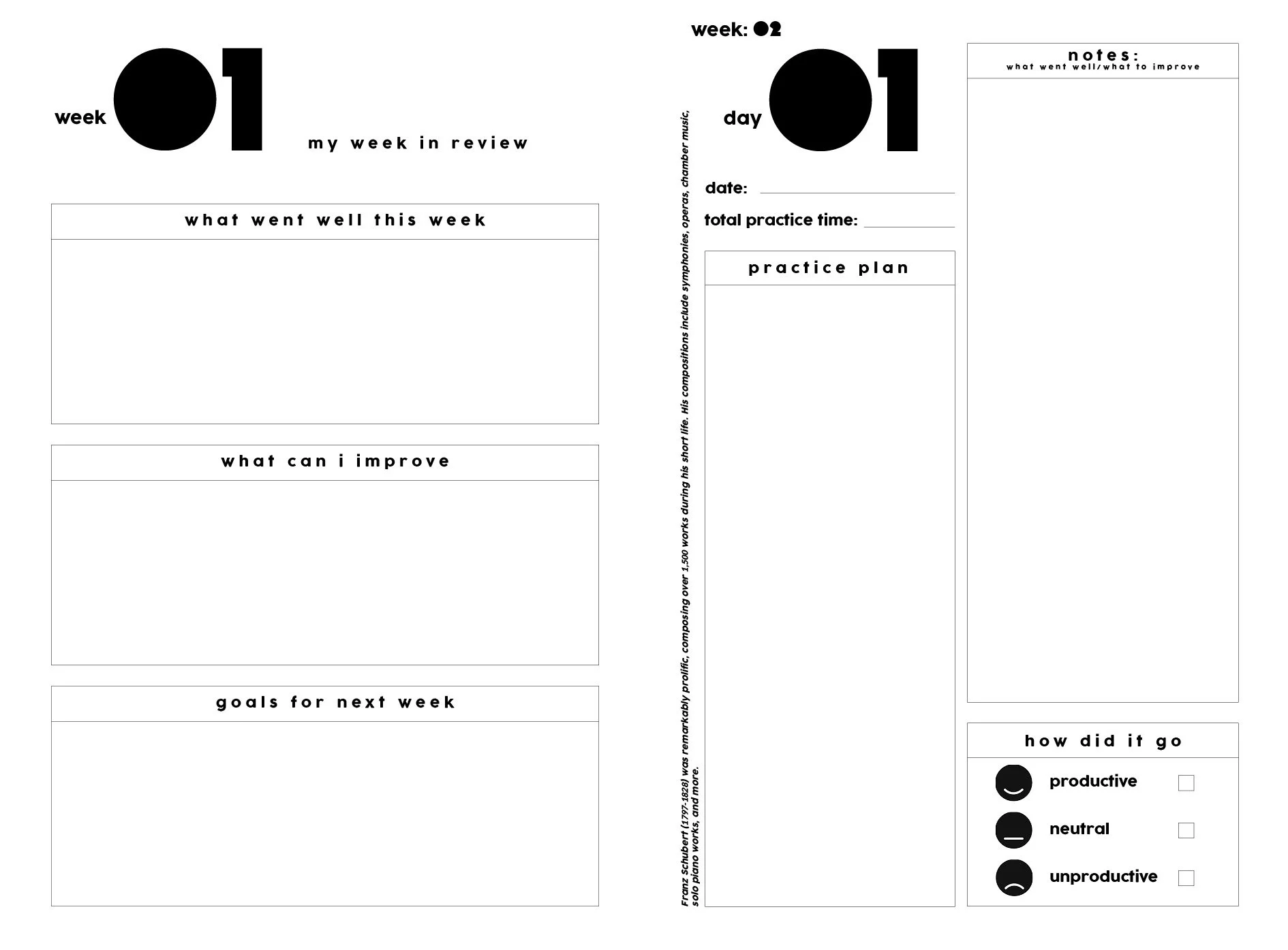
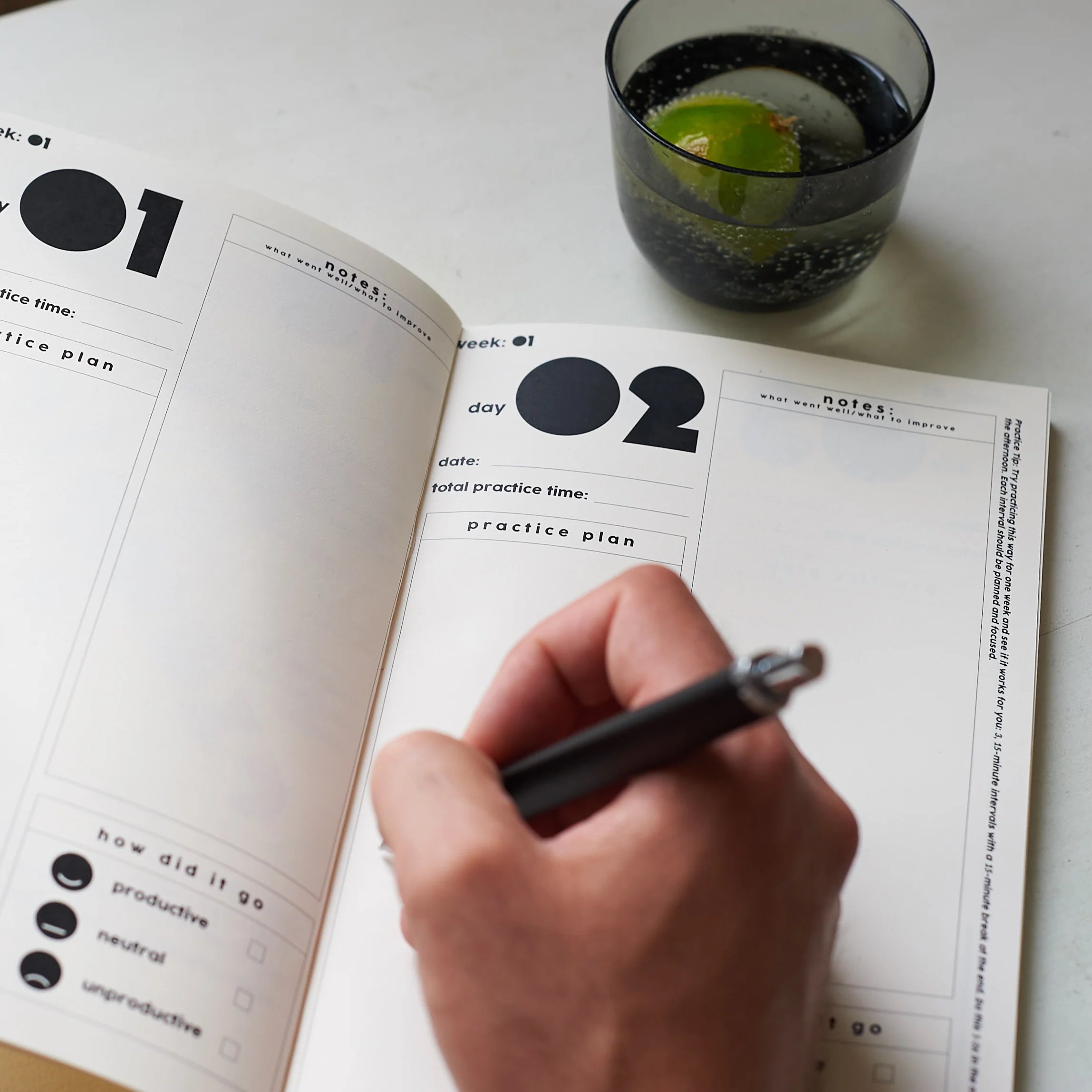
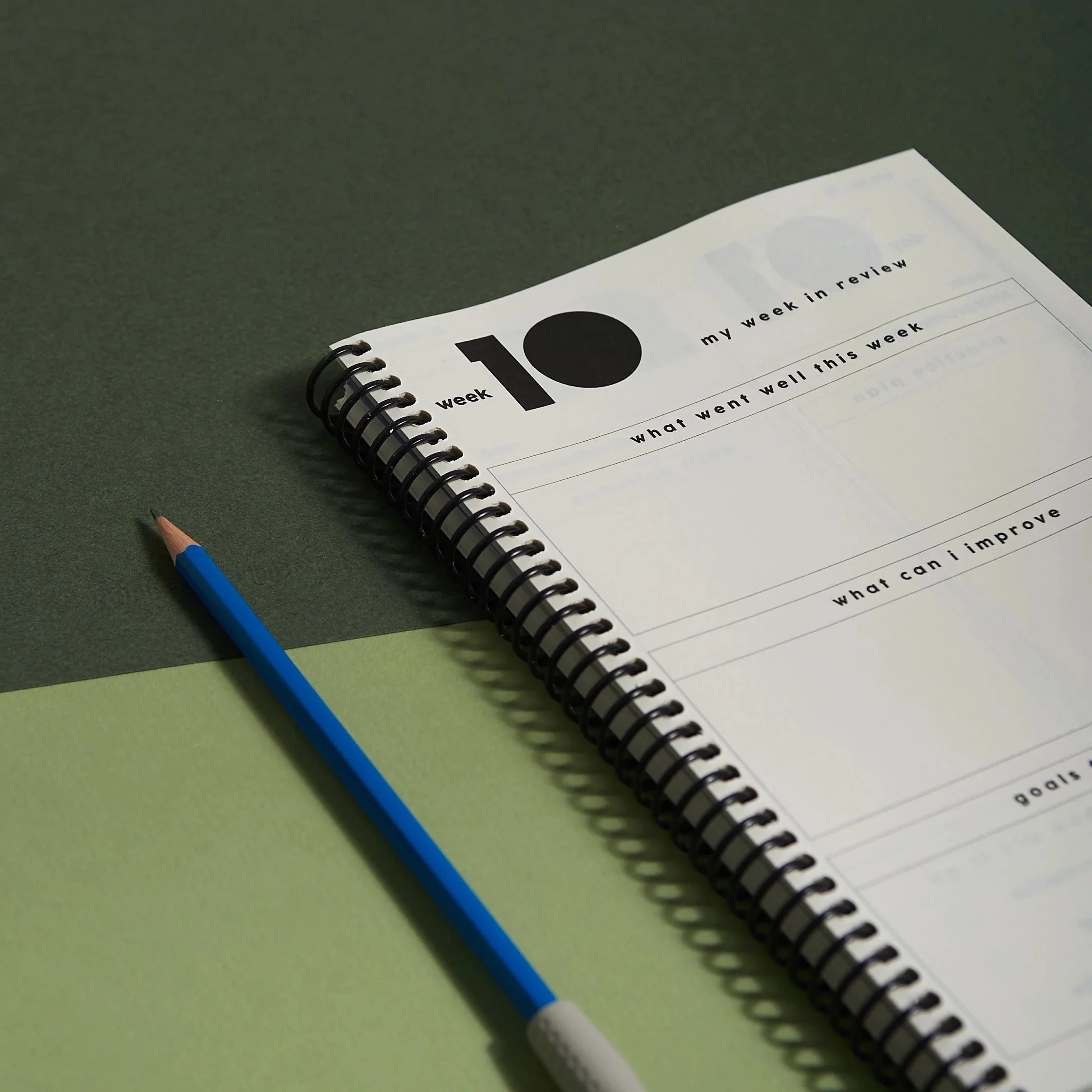
The interior is designed to help musicians plan, reflect and stay motivated. Each spread includes space for a practice plan, notes and a simple check-in, encouraging consistent and focused practice over time.
05 / THE FINAL PRODUCT

06 / THE ORIGINAL CONCEPT
BELLTONE
Brand Identity / Logo Design / Merchandise Concepts
The project began as Belltone, a personal training concept developed specifically for musicians. We created a visual identity built around a bold, geometric logo, a contrasting blue and orange palette, and a series of merchandise applications.