Black illustrated Kill! Kill! Coffee logo with expressive hand-drawn lettering on a bright yellow background.

SELECTED WORK / 01— BRAND IDENTITY

KILL! KILL! COFFEE

IDENTITY / GRAPHICS / PACKAGING / INTERIORS

TORONTO, CANADA

2026

01 / THE PROJECT

KILL! KILL! COFFEE

Kill! Kill! Coffee is a Toronto coffee shop and creative space with a visual identity built around expressive typography, saturated colour and graphic illustration.

Developed across branding, packaging, merchandise, menus and the café interior, the identity connects the different elements of the business through a consistent visual language.


02 / VISUAL IDENTITY

LOGOTYPES / COLOUR / TYPE
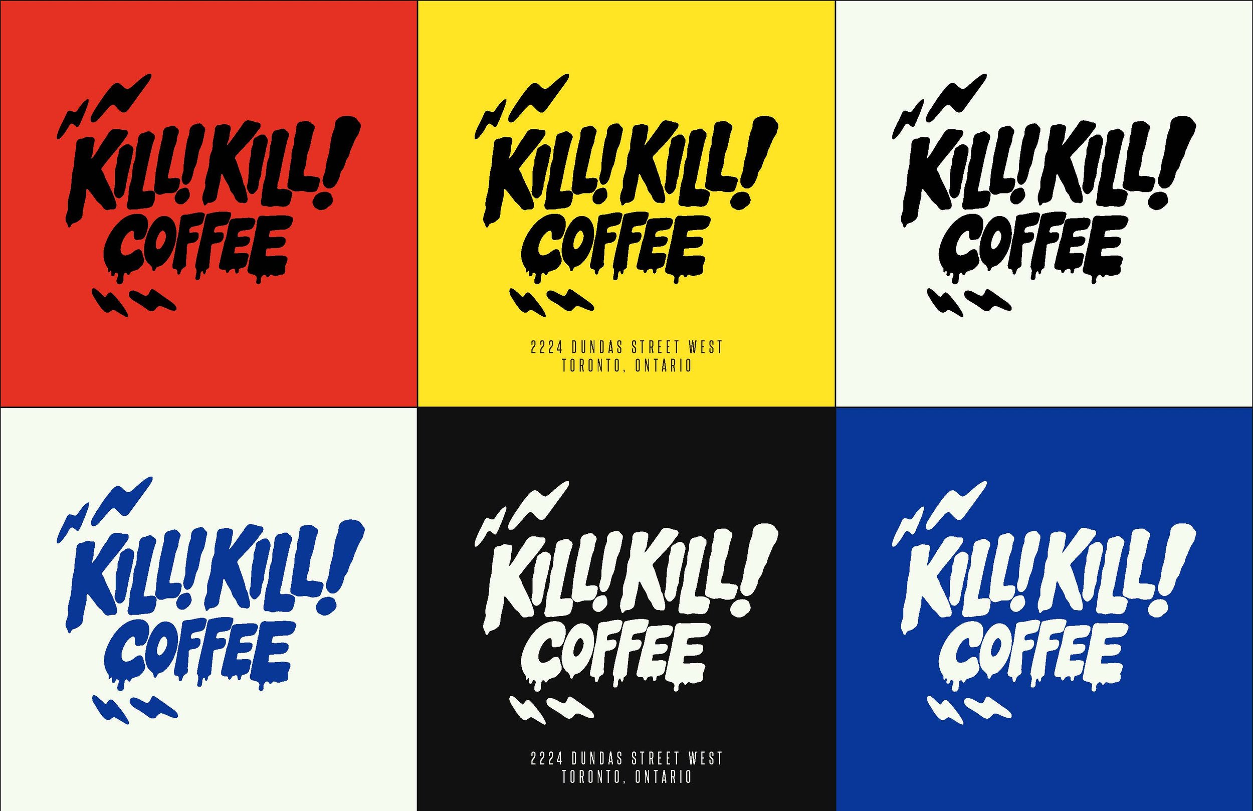
Kill! Kill! Coffee logo variations presented in red, yellow, cream, black and cobalt blue as part of the brand identity system.
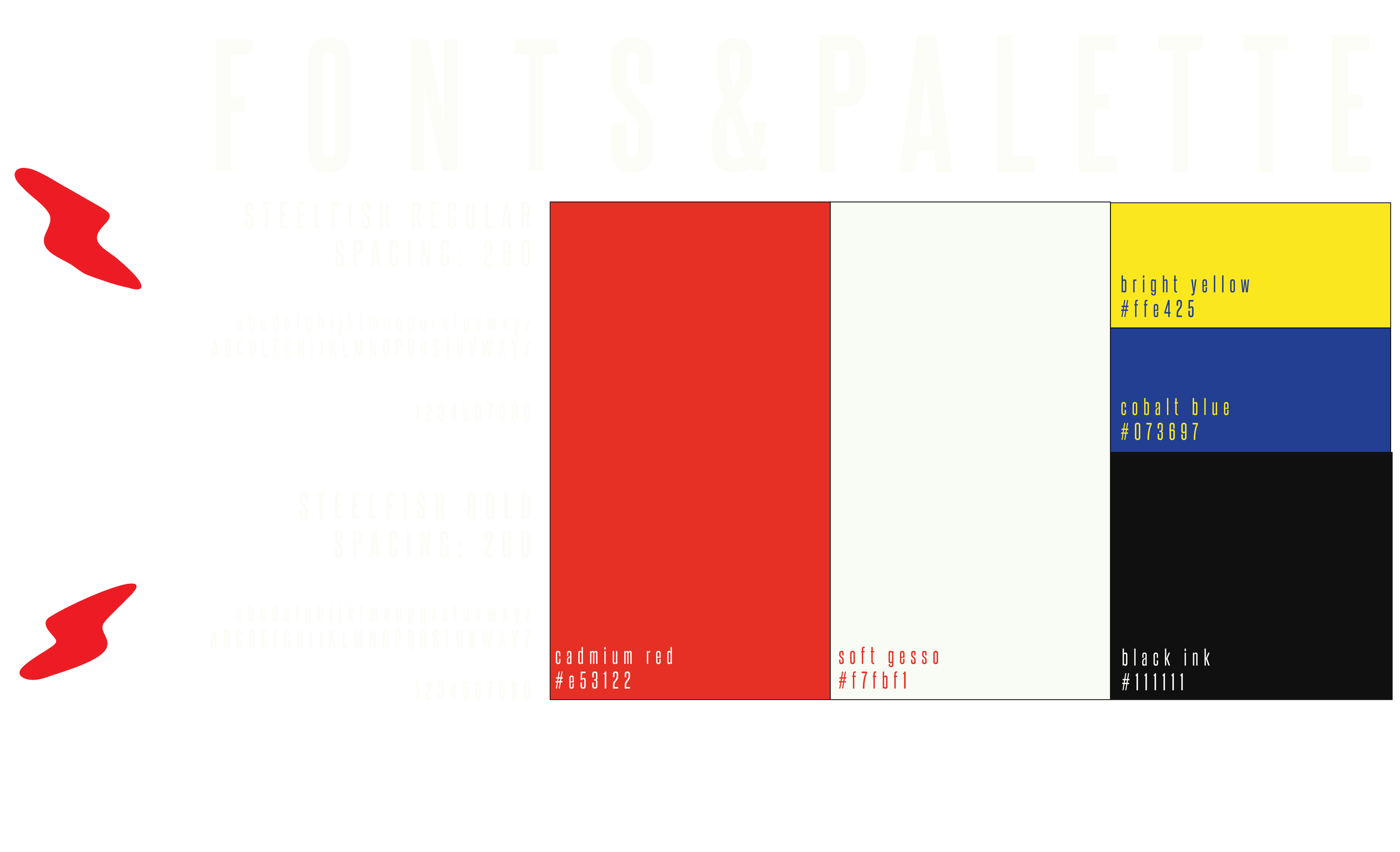
Kill! Kill! Coffee brand guidelines showing the K! symbol, SteelFish typography and a bold red, yellow, blue, black and cream colour palette.

THE BRAND. OUT IN THE WORLD

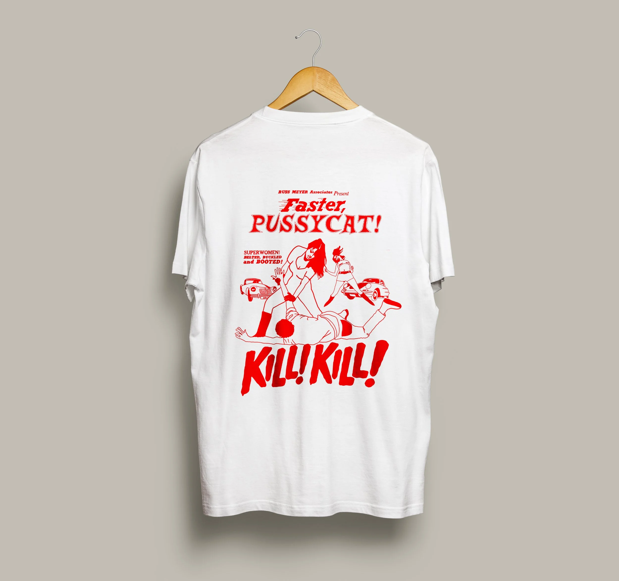
White Kill! Kill! Coffee merchandise T-shirt featuring a bold red illustrated graphic inspired by Faster, Pussycat! Kill! Kill!
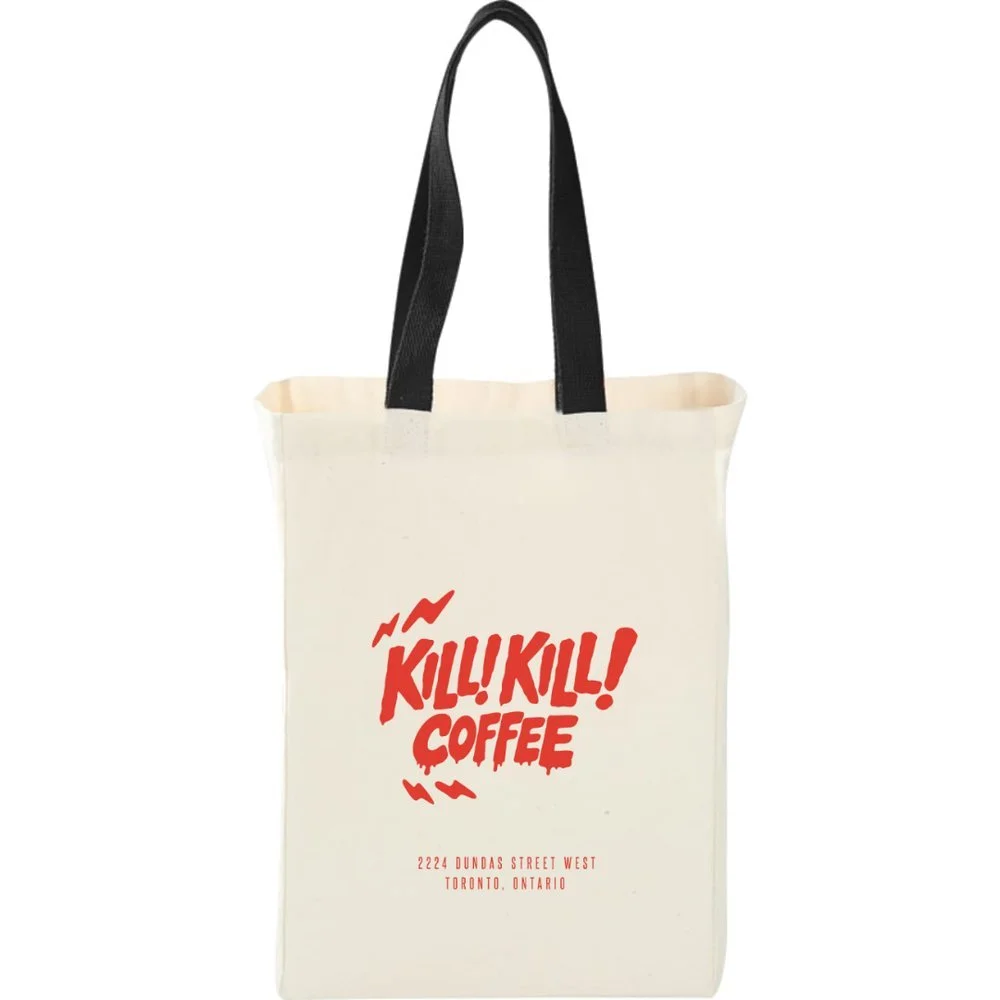
Natural canvas tote bag with black handles and the Kill! Kill! Coffee logo printed in red.

03 / MERCHANDISE

NOT JUST A COFFEE SHOP.
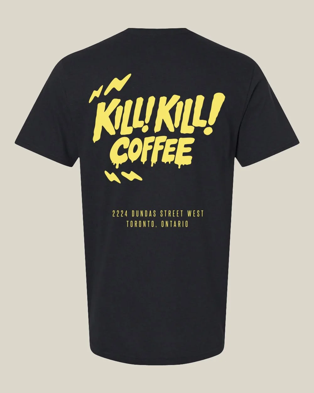
Black Kill! Kill! Coffee T-shirt featuring the illustrated yellow logo and Toronto location lettering.

BRANDED APPAREL / IDENTITY


04 / PACKAGING
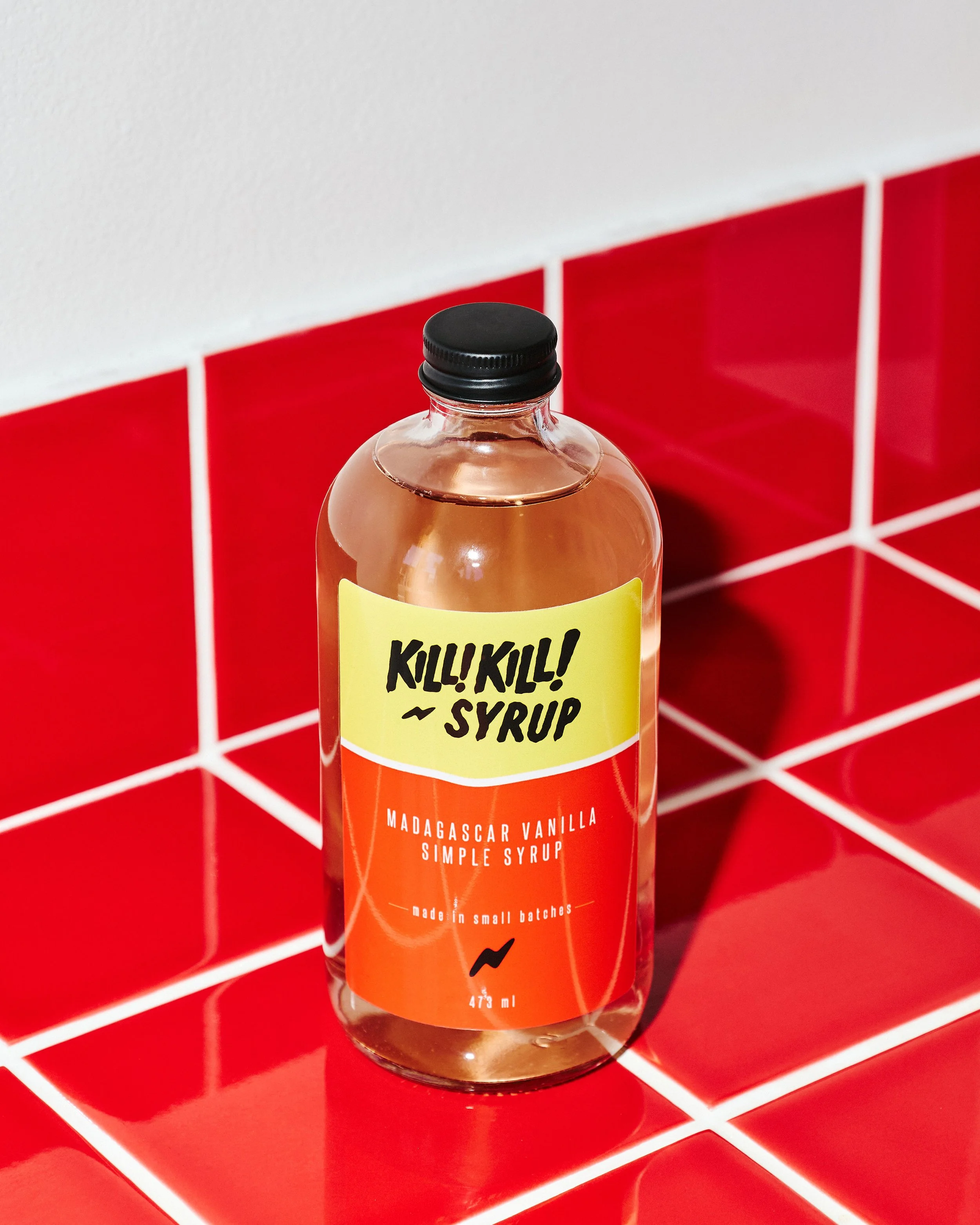
Kill! Kill! Coffee Madagascar vanilla simple syrup bottle with a custom yellow and red label, photographed against red café tiles.
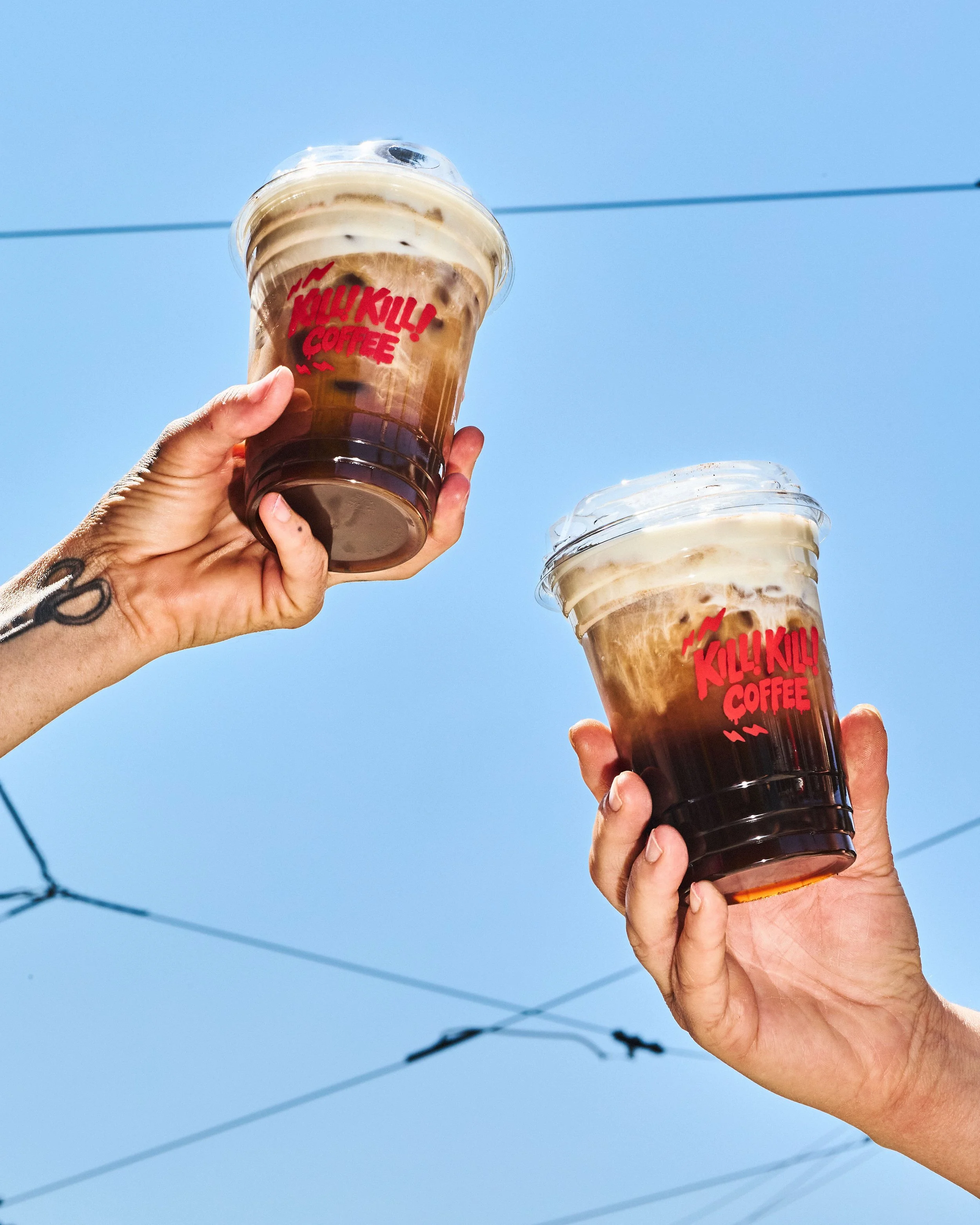
Two clear iced coffee cups featuring red Kill! Kill! Coffee logos, held against a bright blue sky.

SMALL BATCH SYRUP PACKAGING AND TAKEAWAY COFFEE CUPS

EVERYDAY OBJECTS
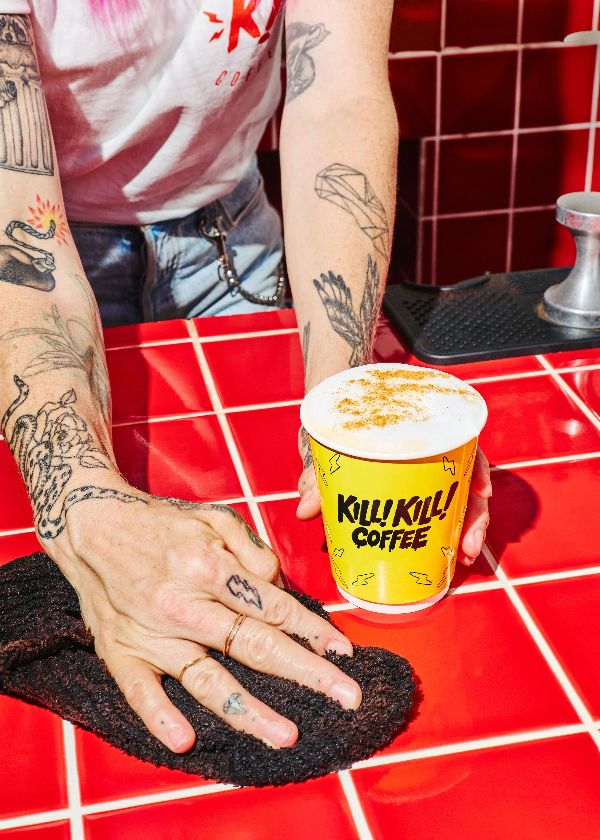
Yellow Kill! Kill! Coffee takeaway cup with black illustrated branding, photographed on the café's red tiled counter.

05 / CAMPAIGN GRAPICHS

CAMPAIGN GRAPHICS.
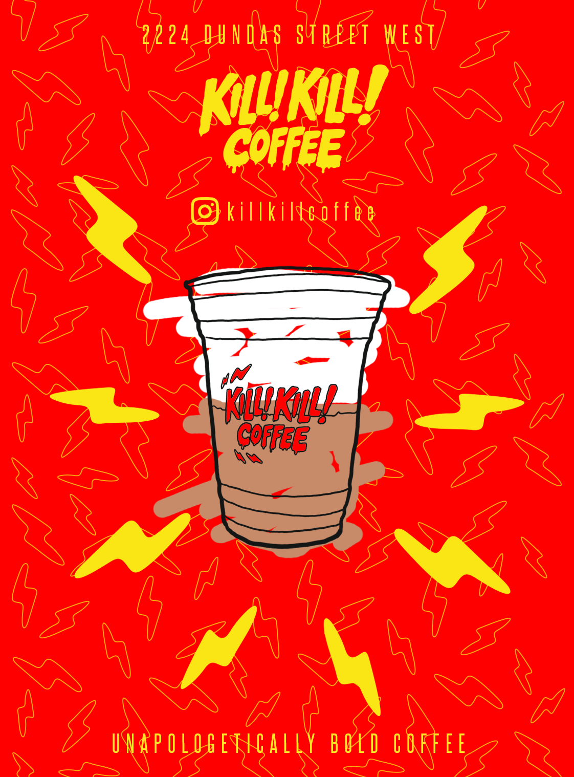
Red and yellow Kill! Kill! Coffee promotional graphic featuring an illustrated iced coffee cup surrounded by lightning bolts.
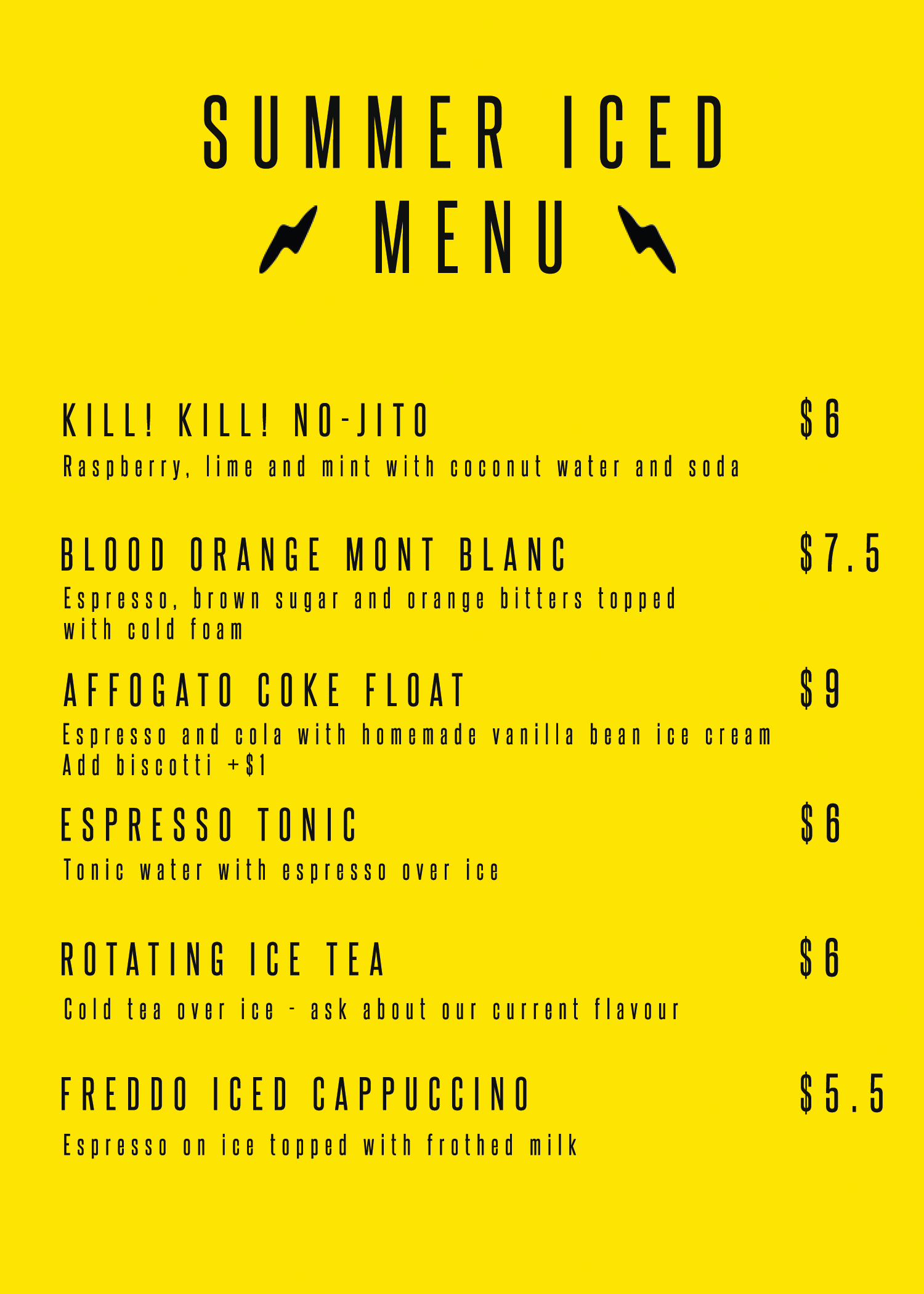
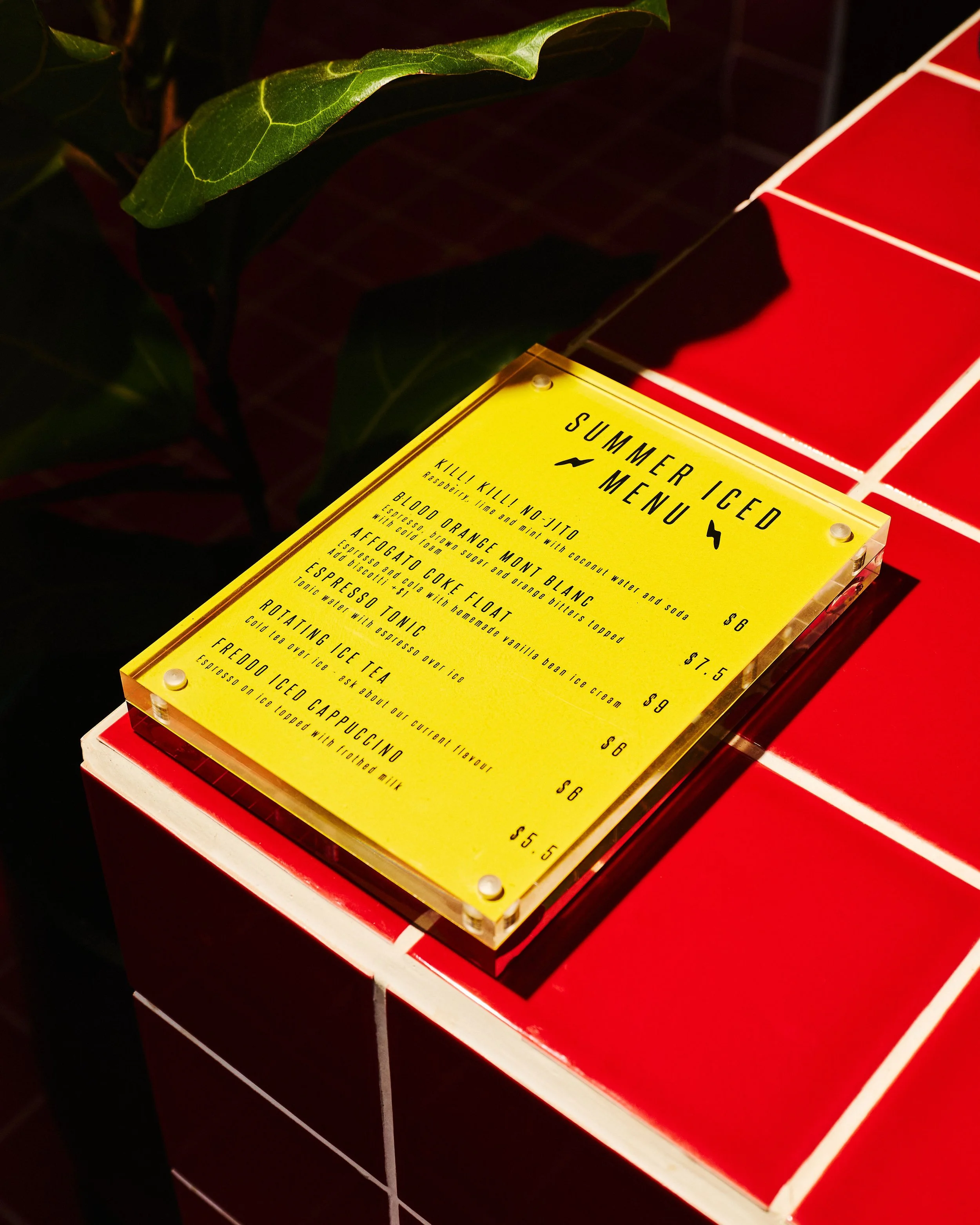
Bright yellow summer iced drinks menu designed for Kill! Kill! Coffee using condensed black typography and lightning bolt graphics.

MENUS / PROMOTION / ART DIRECTION

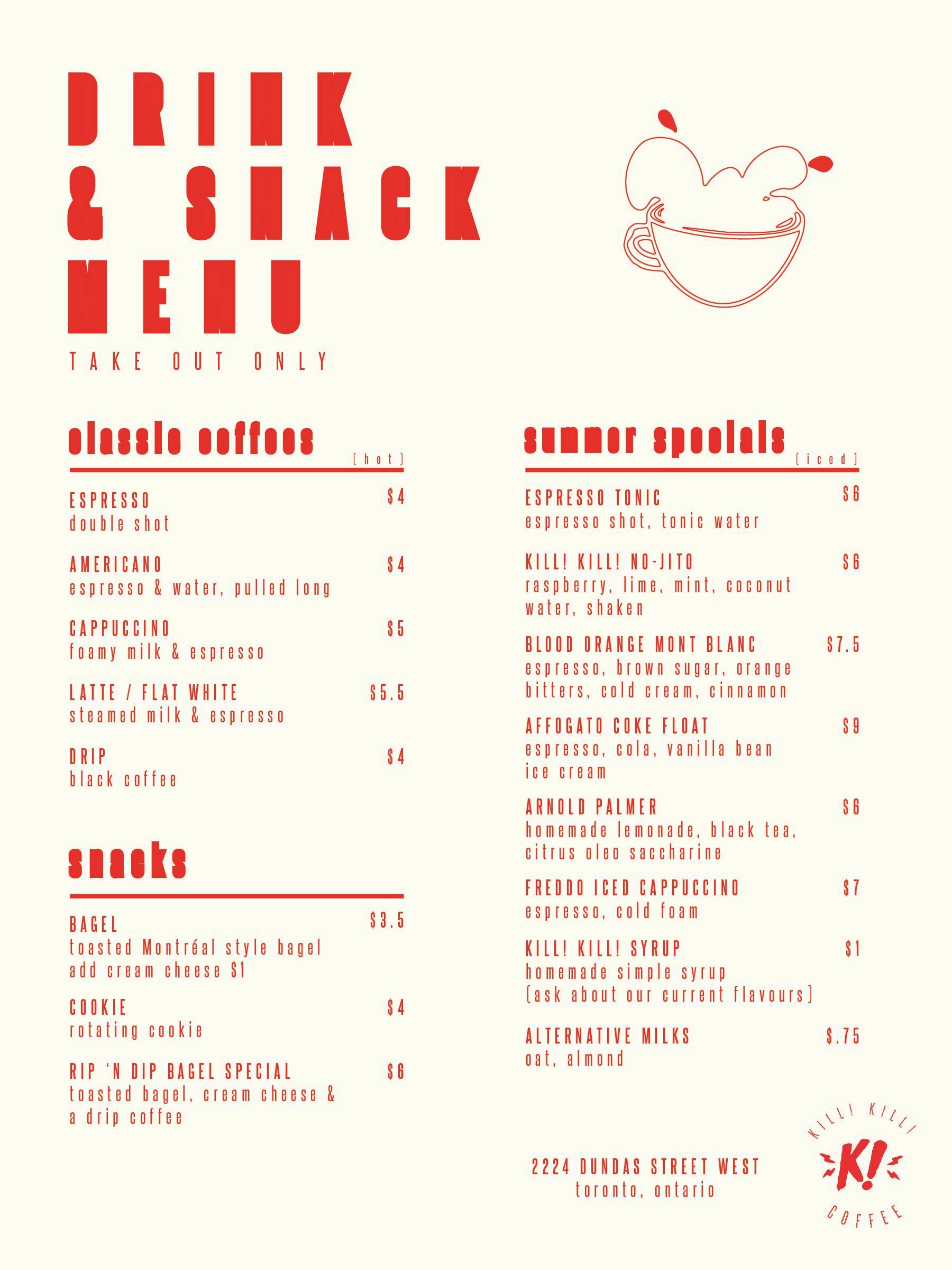
Kill! Kill! Coffee takeaway menu design with bold red typography, illustrated lips and separate sections for drinks and snacks.

06 / THE SPACE

OFF THE PAGE. INTO THE SPACE.
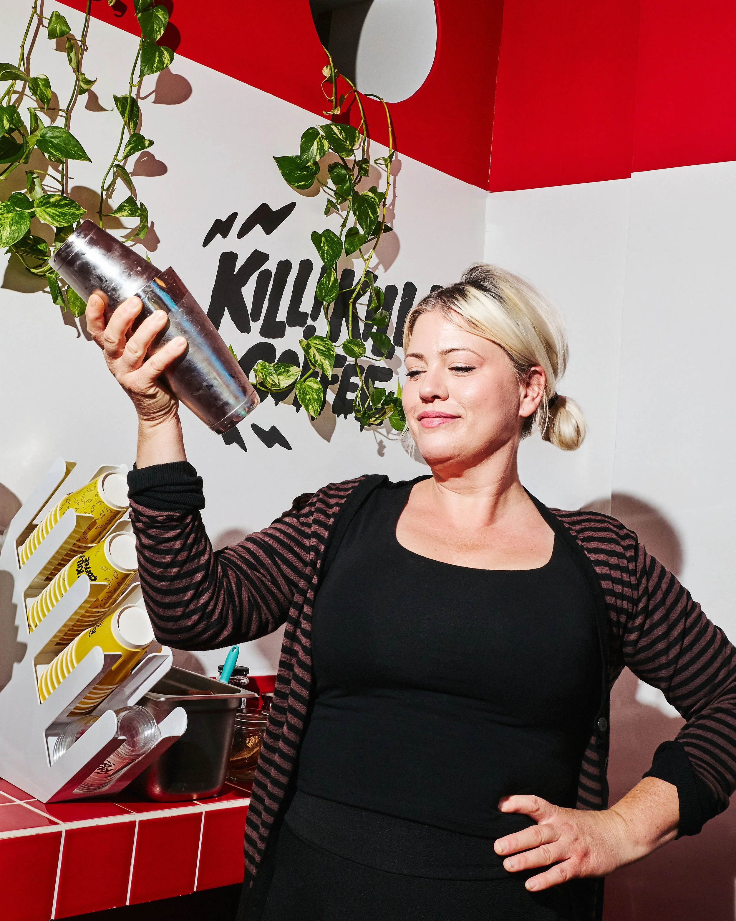
Barista holding a cocktail shaker inside Kill! Kill! Coffee, surrounded by red tiled counters, hanging plants and wall branding.
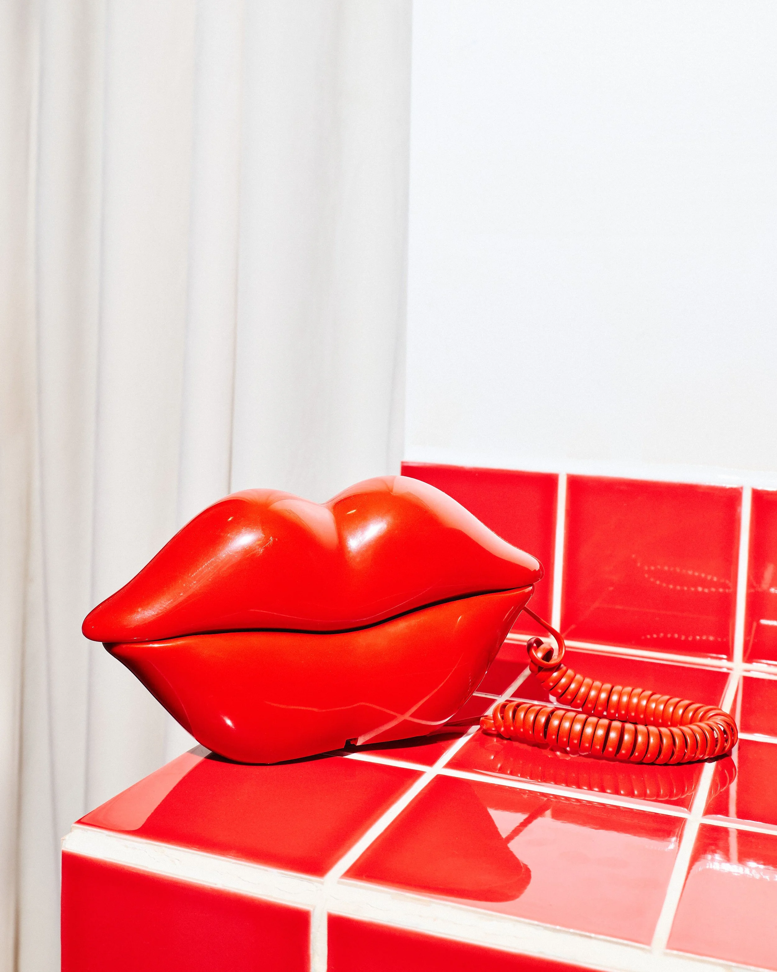
Sculptural red lips telephone displayed on a glossy red tiled counter inside Kill! Kill! Coffee.
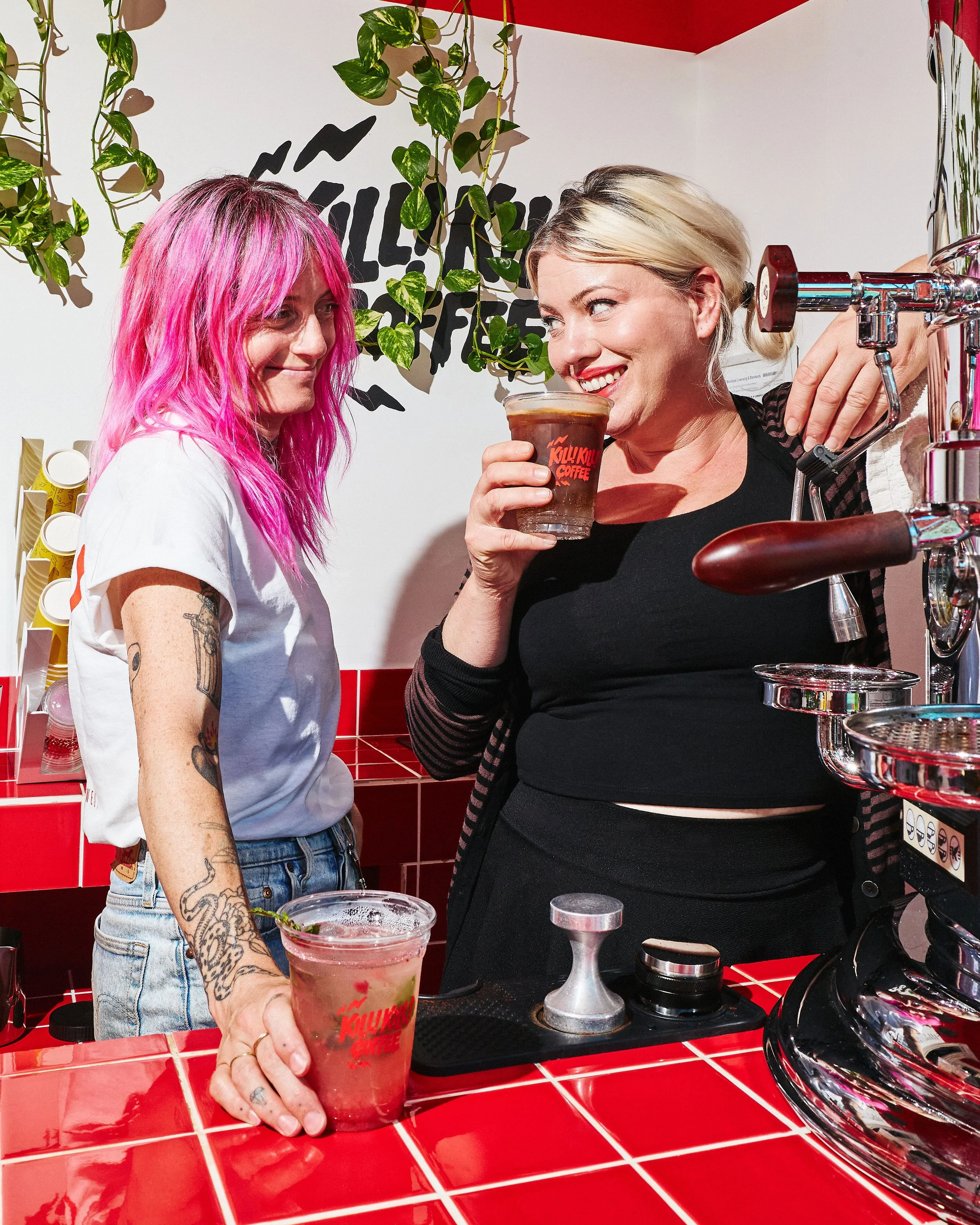
Two people behind the Kill! Kill! Coffee counter with branded iced drinks, red tiles and a chrome espresso machine.
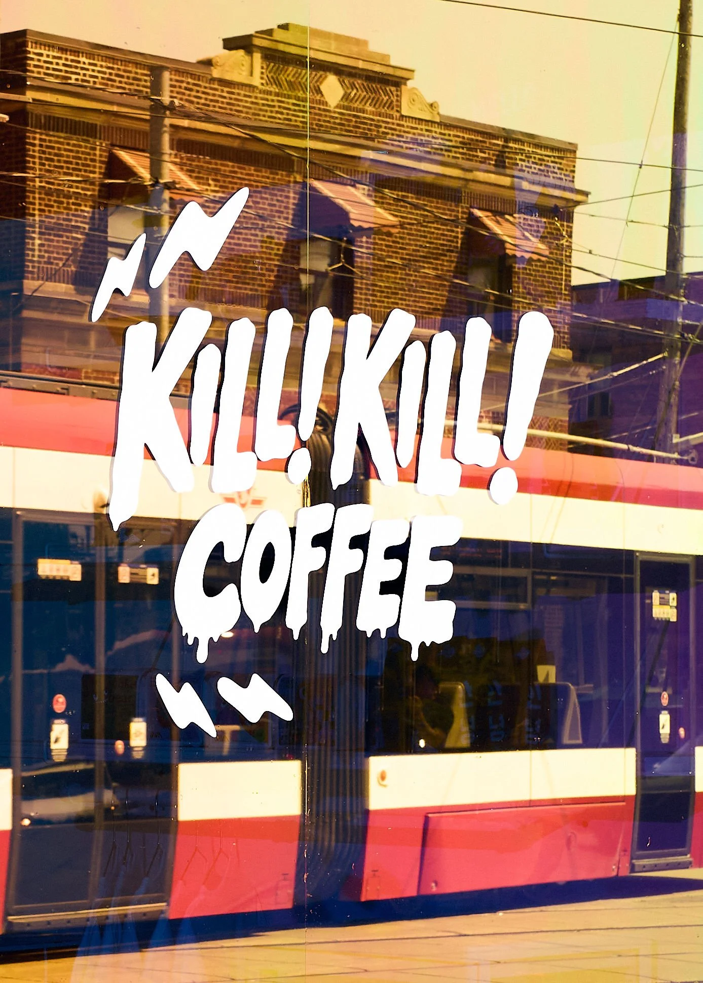
Large white Kill! Kill! Coffee illustrated logo applied to the café's front window in Toronto.
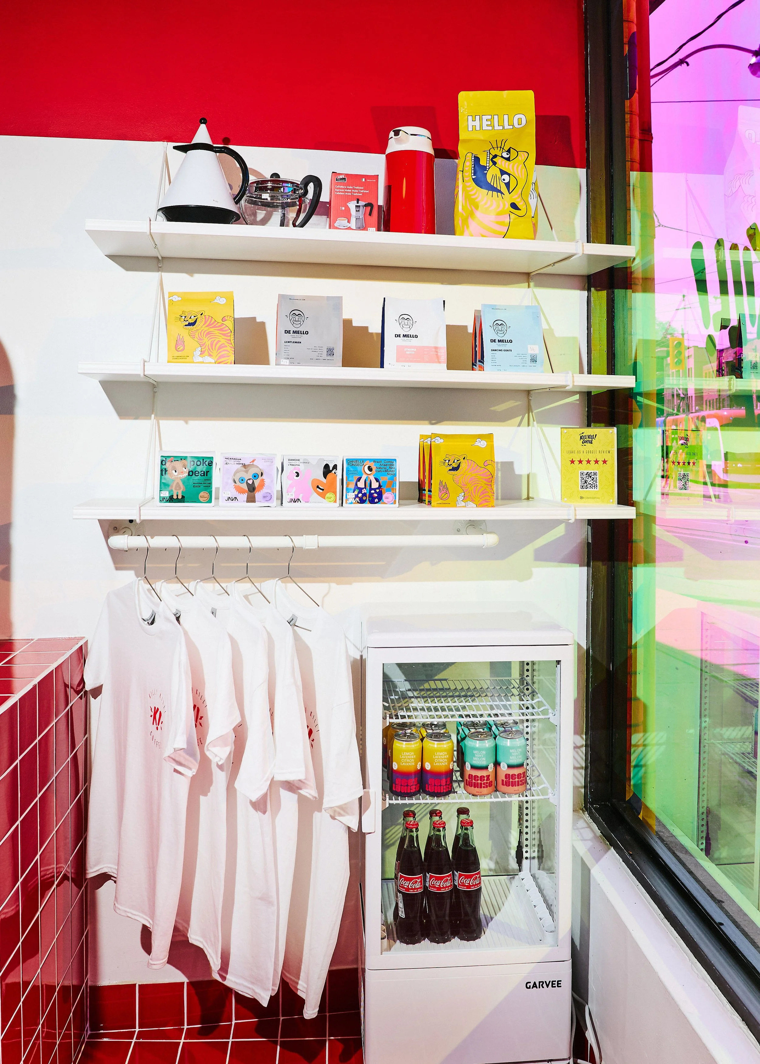
Café retail display with colourful coffee bags, branded T-shirts and a drinks fridge beside the front window.
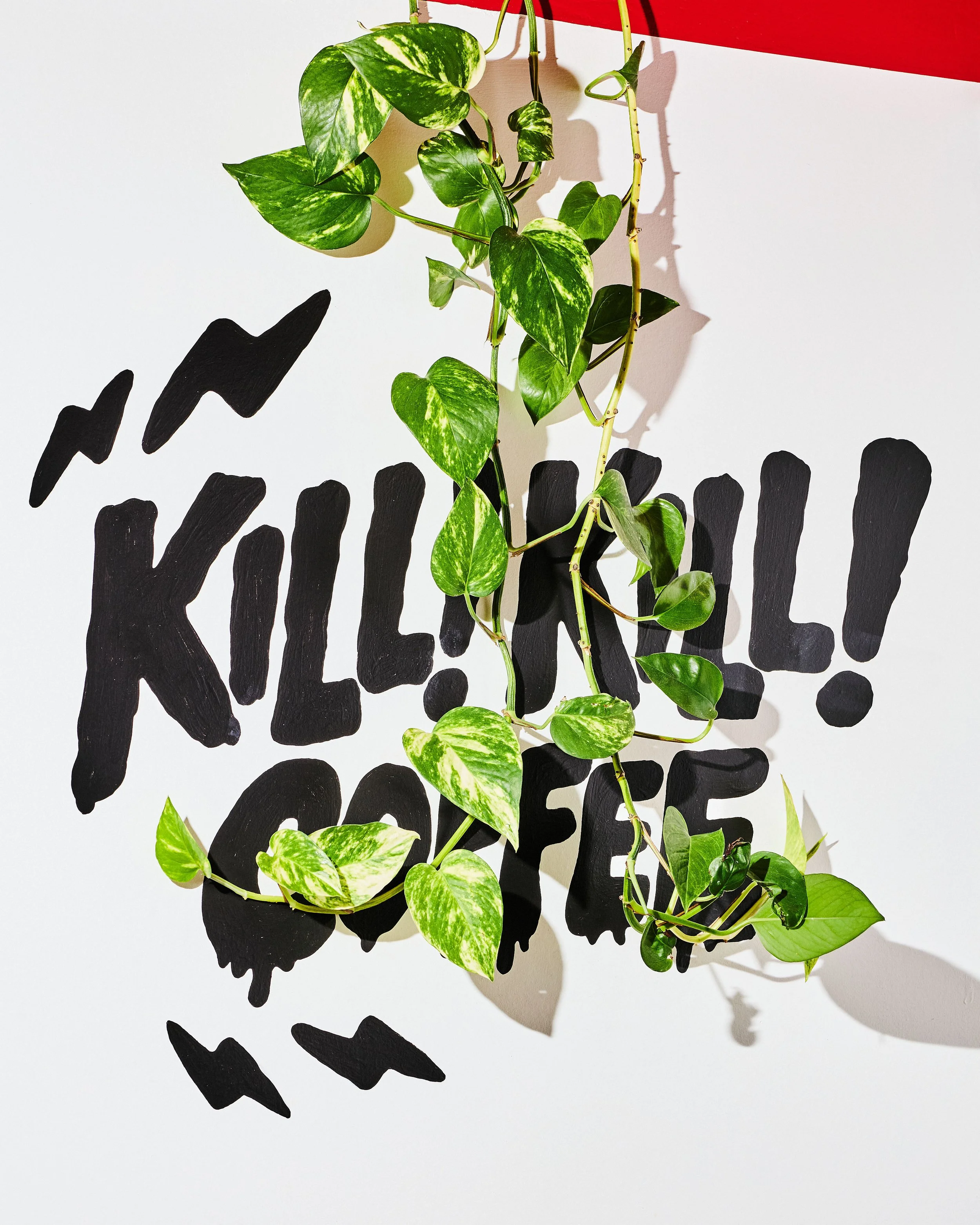
Large black Kill! Kill! Coffee wall logo partially framed by trailing green plants inside the Toronto café.

THE VISUAL IDENTITY CARRIED THROUGH THE CAFÉ AND EVERYDAY CUSTOMER EXPERIENCE

BRAND MEETS INTERIOR
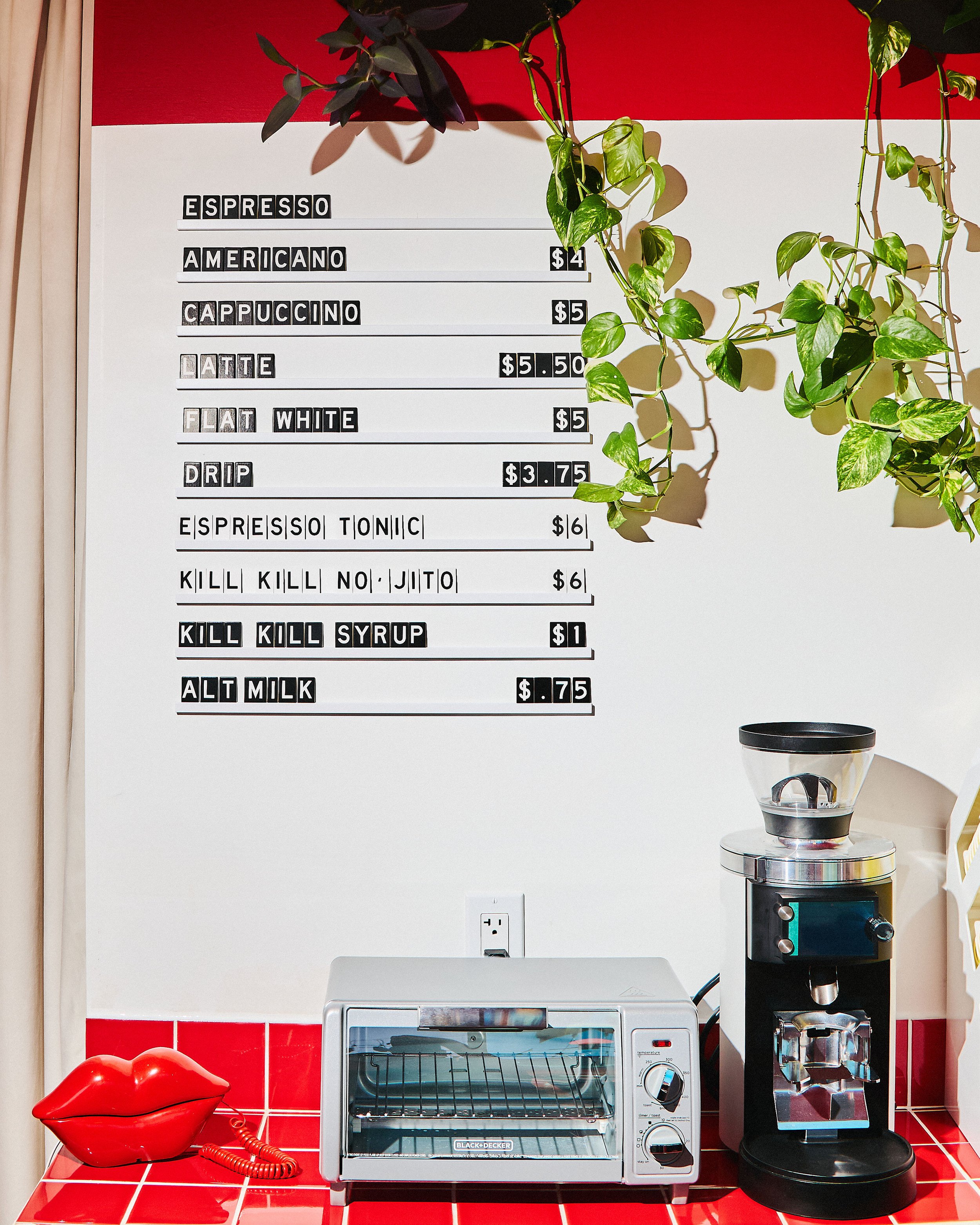
Kill! Kill! Coffee café interior featuring a black-and-white menu board, red tiled counter, coffee grinder and hanging plants.
Bright yellow summer iced drinks menu displayed in a clear acrylic holder on the café's red tiled counter.
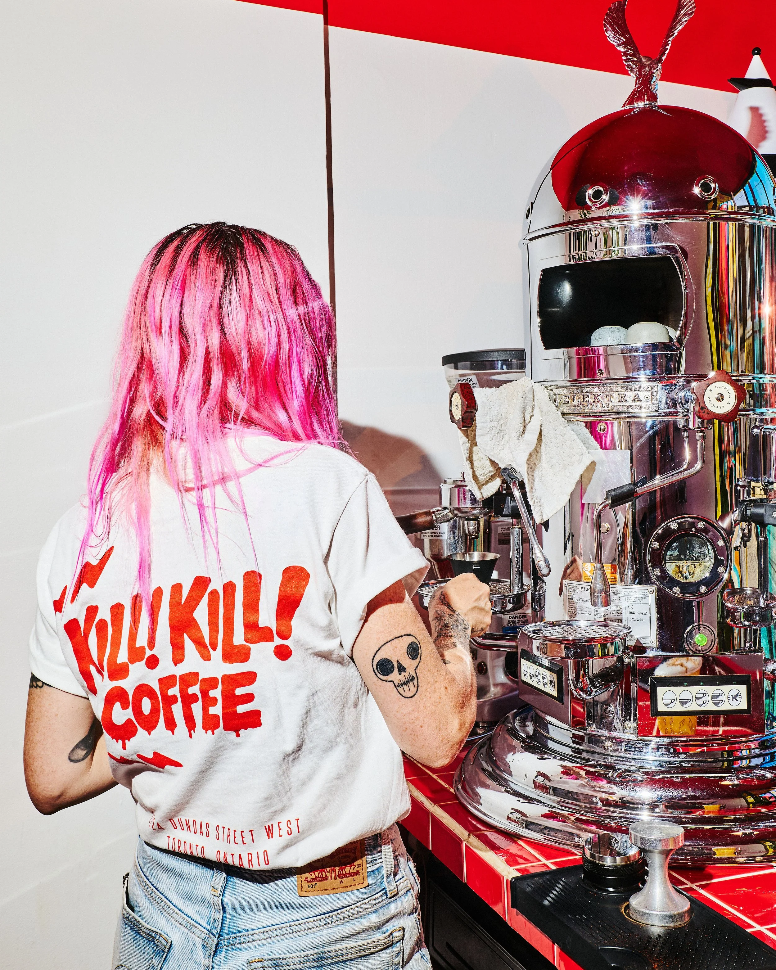
Barista wearing a white Kill! Kill! Coffee T-shirt with a red logo while working at a chrome espresso machine.    Copy all image names and alt text